AIGA knows a thing or two about design. As the largest and oldest association of professional designers in the United States, AIGA has invested considerable…
Rx for Success — Effective Pharmaceutical Marketing
Client:
Taro Pharmaceuticals, New York.
Pharmaceutical sales can be rough: lots of competition, big budgets, big egos. So what’s a marketing manager to do when all of the high-maintenance salespeople are clamoring for state-of-the-art sales aids?
![]()
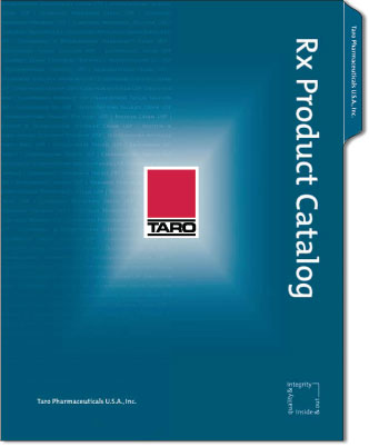
Donna Bandal, Senior Marketing Manager and Product Manager at Taro Pharmaceuticals, was no stranger to high-stress situations. Her entire career had been spent in the pressure-cooker of medical marketing, and when the Senior Group Vice President of Sales and Marketing tasked her with creating a high-profile catalog of Taro’s Rx product line, Donna didn’t waste any time.
Preliminary research is important, to be sure …
She worked through the preliminary steps — meeting with Sales and Marketing to capture each team’s vision, interviewing the account managers to understand their needs and wants, reviewing and collecting numerous competitors’ profile pieces, making competitive analyses, collecting all up-to-date product specs and prices, preparing a detailed marketing brief, and authoring all of the copy. But when it came time to start work on the design, Donna bypassed Taro’s in-house art department. This was a high-profile piece, and she wanted to step up the level of creativity.
But — selecting the right creative design agency is vital
“Donna had seen my work several years earlier at another medical marketing client,” said David Wright, president and founder of IDU Creative, “So when things got hot at Taro, she pulled up my number and called me in for an estimate on the creative work. Since we deliver ‘agency know-how at in-house prices’, she felt confident in her assignment of IDU and scheduled a face-to-face meeting.”
“I had been impressed with David’s approach,” said Donna. “He really listens, always asks the right questions, and quickly learns and incorporates the industry-specific details that are so important to the success of any project.”

Finding the best design solution for the project requirements
After reading the marketing brief and immersing himself in proprietary research Donna provided, David proposed a an elegant six-panel folder with the required pockets, saddle-stitched brochure and inserts. He presented several design approaches, but the favorite was an approach using a striking color scheme to emphasize to the Taro ‘red square’ logo, with accents provided by a combination of dull and gloss varnish.
“Donna asked me to keep the printing budget reasonable,” said Wright. “We went all-out on the outer folder shell to make a great first impression, using the four process colors plus the corporate spot color and two spot varnishes, but to keep printing costs down, we designed the inner brochure as a two-color piece and the inserts as two- or three-color pieces. To add tonal richness, we rendered the brochure photographs as duotones. The interplay between the full-colored folder and the duotones in the brochure was very effective.”
Turnkey printing keeps things easy
Since IDU has working relationships with many fine printers, Donna asked David to prepare a Request for Proposal and solicit bids from three printing companies. Keeping the process ‘turnkey’ and contained with one creative agency was critical for Donna, and IDU Creative was able to accommodate. After evaluating the bids and reviewing the results, Donna and David selected Monroe Litho in Rochester, New York to print the catalog. Davis Frame and his team at Monroe Litho worked diligently with David to ensure that the tricky combination of dull and gloss varnish would work as David intended, and that the colors would remain true between the process-color folder and spot-color inserts.
Excellent work leads to effusive accolades …
When the completed project arrived at her office, Donna sent David an enthusiastic note: “The Senior Group VP of Sales and Marketing absolutely loves the piece!”
The sales force was equally enthusiastic — and within six months Taro had to place an order for a second print run due to the accolades it received, both internally and with the pharmacy buyer audience. Once again, Donna’s grace under pressure had achieved outstanding results.
David’s newly designed ‘Quality & Integrity Inside & Out’ tagline logo was also a huge success. The logo initially appeared on the Rx Catalog, but the response was so positive that it soon began appearing in many other places as well, including sales literature, labeling, and multiple Taro websites (Taro USA, Taro Israel, Taro Canada, Taro UK, and Taro International).
“IDU Creative always produces quality work at the right price and within timeline,” said Donna. “I couldn’t have been more satisfied with the overall turnaround of the project. Well done!”
… And more work to come
Good news spreads quickly, and before too much time had passed, Taro’s OTC (Over The Counter medicine) division contacted David with a request to capitalize on the success of the Rx catalog by designing an OTC piece which maintained the same look and feel while changing color and content to emphasize the OTC line as an exciting and profitable business opportunity.
But that’s another story … read more of our case studies.
Article Summary
Name
Rx for Success — Effective Pharmaceutical Marketing
Description
A case study of developing pharmaceutical marketing materials — from defining project requirements through design to delivery of final printed pieces — by IDU Creative for Taro Pharmaceuticals.
Author
David Wright
Publisher
IDU Creative
Related