
Here are some of the common design words and graphics terms that people have asked us about over the years. These are also good graphic designer words to know, especially to better understand the work involved in printing and design.
A
alignment: or typographic alignment, is the way that text, images, and other graphic elements are positioned together (or not). For example, the graphic designer can cause the text to be “left aligned” (all the words are neatly in line on the left), or “right aligned” (in line on the right), centered (in line from the middle), or “justified” where words and graphics are spread out across an area to form a square, or block-like appearance.
B
bleed: the part of a printed page that gets trimmed during the printing a book, magazine, or brochure. The “printing bleed,” for example, is the extra part of photography or graphics that bleeds (goes beyond) the printed margins, and gets cut off when the pages of a book are printed and cut to size.
body copy: the main text, or content used in a brochure, website, app, or other design involving words.
C
camera-ready graphics: this means a document or file is ready for printing and reproduction. Magazines, printers, and book publishers often ask the graphic designer for “camera ready” artwork, photos, and files that are “final” — in the right format, with the right color settings, dimensions, and content.
CMYK: an acronym for Cyan, Magenta, Yellow, and Key (black). These are the basic colors that are used to create all other colors for printing magazine, newspapers, brochures, and other printed materials.
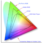
color gamut: the range of colors which are capable of being displayed on a given form of media. For example, offset printing can display a range of colors from the CMYK color space which is different from the range of colors displayed on a computer monitor in the RGB color space.
color space: an agreed-upon organization of colors, such as RGB or CMYK. When combined with physical device profiles (for either digital or analog devices), this yields very useful color gamuts, which show the range of colors that a particular device or printing process is capable of displaying.
crop mark: these are often placed in the margins of a print design as a guide for printers, so they know where the design ends, and where to cut or crop the printed design.
D
DPI: is an acronym for Dots Per Inch. As the name suggests, it is the measure of dots per inch on paper or printed materials. The higher the DPI, the better the quality or resolution. The standard resolution for printing is typically 300 DPI, with 600 DPI used for better quality. The standard for web and digital presentation, such as on a laptop or smartphone screen, is 72 DPI. Your graphic designer will always want the highest resolution, as these can be down-sampled to any lower resolution, but never up-sampled to a higher resolution.
E
export: transforming an original file (from one app) to another format (for use with another app). Exporting a graphics file usually involves choosing different elements and parameters such as quality, resolution, and file format. For example, you can create a .PSD file in Photoshop and export it to various other files types, such as .PNG, .JPG, .TIF, etc.
F
font: the style, size, and appearance of letters and numbers. As an element of typography, it’s the style in which letters are printed or displayed, and usually associated with a “typeface,” such as “Times New Roman,” “Helvetica,” “Arial,” “Garamond” — and thousands of other unique styles. Fonts are one of the most important elements that determine the “look and feel” of text.
G
gutter: in printing and binding a book or magazine, the gutter is the blank, open space between two facing pages. For example, if you open a magazine to its centerfold, the space between the two pages (in the middle) is the gutter.
H
hierarchy: or design hierarchy, refers to the way design elements are arranged to suggest a sense of importance and organization. More than just an outline, it’s the way things are designed and appear that suggest how different elements are related, and which items are more important, and less important.
I
image compression: involves two kinds of compression, which maintain or reduce the quality of a digital image: lossless; and lossy. A digital image can be compressed, or reduced in size in many ways, typically through reducing the number of colors in the image; “losing colors” is a kind of lossy compression. A digital image can also be compressed without losing colors with various “lossless” methods such as run-length encoding and deflation. Image compression of graphics also involves other aspects of a digital image, such as bit-rate, progression, the metadata attached to the image, and more. Lastly, different types of image files (.JPG, .TIFF, .PNG) involve different kinds of image compression.
J
JPEG or JPG: an acronym for Joint Photographic Experts Group — and one of the most common image formats used in print or digital display. Typically, high-quality JPEG graphics have higher DPI resolutions, and are larger in size. A 300-dpi JPEG is the standard for print materials. And 72-dpi is the standard for displaying JPGs digitally.
K
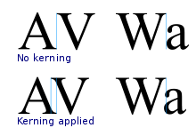
kerning: adjusting the space and alignment between individual letters and numbers, so that particular pairs are easier to read. Kerning is the opposite of tracking (in which a graphic designer applies even space between blocks of characters).
L
leading: the vertical space between a line of type. Too much or too little leading can make things difficult to read. The term “leading” comes from early work of typesetting, when metal was used to form the shape of letters and numbers, and strips of lead were placed in between to separate lines of text.
logo design: the process of transforming the character, identity, and “personality” of a business, brand, or person into an easily-recognizable and befitting symbol. Logo design is just one process involved in developing a brand. And a good logo should make it easy for people to relate to and recognize the brand.
lorem ipsum: refers to “dummy text” or “placeholder copy” — a mix-up of words used to show the design of text (while the actual text is being written). The name refers to the first words of Cicero’s “The Extremes of Good and Evil” (written in 45 B.C.), which is often used as dummy text: “Lorem ipsum dolor sit amet…”
M
measure: the width of block of text. When it comes to reading text and optimal readability, shorter measures are typically easier and more enjoyable to read. Aside from appearance, changing the measure also involves the feeling of “pace” or “speed” involved in reading text.
mock-up: a basic model or design sketch which a graphic designer uses to show organization and fundamental aspects of a design. A mock-up is typically used at the beginning of the design process to show basic ideas; the graphics are usually revised and refined with more and more details added as the design progresses.
N
negative space: the blank area or empty space around a logo, object, or other visual graphics. When it comes to good design, what you put in matters, but what you leave out matters as well. A good graphic designer knows how to use negative space creatively and effectively.
O
orphan: a line of text that appears alone and separated from the rest of a paragraph — which continues on another page or section of text. Orphans can make text appear disorganized and difficult to read. A graphic designer uses good organization and keeps paragraphs together to prevent orphans. An orphan is the beginning of a paragraph, separated from the rest of the paragraph (it is the opposite of a widow).
P
pixel: the smallest element or “dot” on a screen that can be colored, controlled, or changed. The word “pixel” was first used in 1965, and comes from a combination of “pix” (for “picture”) and “element” to form “pixel.” Pixels are measured by “ppi” — pixels per inch.
Q
quarter-tone: similar to a half-tone printing, (think Roy Lichtenstein or newspaper print), quarter-tone print involves producing dot sizes that are 25% — or a quarter — of the dot area.
query: a request for information from a database (“data query”). Basically, there are two kinds of queries: a “select query” which simply involves retrieving data (as is); and an “action query” which involves performing some kind of action, or operation with the data, such as appending, updating, inserting, or deleting it.
R
registration mark: a symbol placed outside the page or printed area used to align pages during color separation and printing. Printing registration marks often look like a circle with a cross (cross-hair mark) or a plain circle along the edge of page.
resolution: in imaging and imagesetting, resolution refers to the number of dots that fit into specific area. Typically, imagesetters can manipulate between 1200 and 2540 DPI. Also, display resolution refers to the DPI of a computer monitor, laptop screen, or other digital display. Usually, the higher the resolution of graphics, the better the quality and sharpness.
S
sans serif: a style of a font or typeface without (sans) lines (serifs) attached to the ends of a character. Popular sans-serif fonts include Arial, Helvetica, and Google sans-serif fonts Roboto, Lato, and Oswald.
serif: a style of a font or typeface that has lines (serifs) attached to the ends of a character, such as: Times New Roman, Garamond, or Courier, and the Google serif fonts Merriweather, Arvo, and Libre Baskerville.
T
tracking: arranging text so that there is equal space between letters, numbers, and symbols. Tracking is the opposite of kerning (in which a graphic designer will adjust the space between particular characters so that they are easier to read).
U
UID: the acronym for User Interface Design, which refers to how the interaction between people (users) and a user interface, or UI: apps, websites, blogs, digital kiosks, etc. More broadly, the term refers to the design of any interface between humans and machines. UID involves many aspects of design: colors, scale, perspective, haptics, the flow of information, the ways steps to complete a process or transaction are presented, and more.
UX: stands for User eXperience — the way a user thinks, acts, feels, and perceives their experience, that is their interaction with an app, website, blog, or other interface. Three fundamental factors of UX involve the user, the context in which a user interacts with an interface, and the system (app, website, etc.) the system itself.
V
verbage: a mash-up of “verbal” and “garbage” often used — incorrectly — to refer to text or “wording on a page” (it’s OK, we know what you mean). The term “verbage” actually refers to text that is poorly written — text that amounts to little more than “verbal garbage” that should be thrown away.
verbiage: unnecessary text; a portion of text that is too “wordy” or needs to be deleted. The term “verbiage” is often misused to refer to text in general. And like “verbage,” the term “verbiage” should technically only be used to refer to text that should be deleted (but no worries, we get it).
W
widow: a widow is the end of a paragraph that is separated from the previous part of a paragraph. While a widow can be used to create a dramatic effect, widows often disrupt the flow of text and can making reading the text less enjoyable. Keeping all of the lines of a paragraph together prevents widows.
X
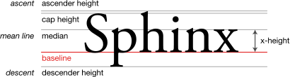
x-height: in choosing a font or analyzing typography, “x-height” refers to the height of the lowercase letter “x.” It is one way of characterizing the features of a font.
XML: an acronym of eXtensible Markup Language, a format used for sharing and rendering structured data.
xylography: a centuries-old printing technique more commonly known as block printing, or woodcut print.
Y
YCbCr: a color space (set of colors) defined according to luminance (Y) and two levels of chrominance (Cb and Cr).
yellowing: the discoloring of natural papers due to age, exposure to sunlight or other factors. Anti-yellowing, acid-free, or anti-aging papers are designed or treated to prevent yellowing, or aging.
Z
z-fold: a type of brochure (or map) that unfolds like an “accordion” where one piece of paper is folded into two or more sections. Your graphic designer can select the best type of fold for your content from a range of folds: z-fold, c-fold, gate fold, half fold, roll fold and many others.